How to Create a Full-screen Menu and Animated Icon with React and Tailwind

I am a teacher, designer and developer on the road to full stack.
I love creatively solving problems by building web applications that look good and work well.
It might just be me, but I've always found full-screen mobile menus to be unnecessarily complicated and time-consuming to build with HTML and CSS, and I'm often not happy with the final results.
So, recently I decided to build one with React and Tailwind, and it couldn't have been easier!
What are we going to build?
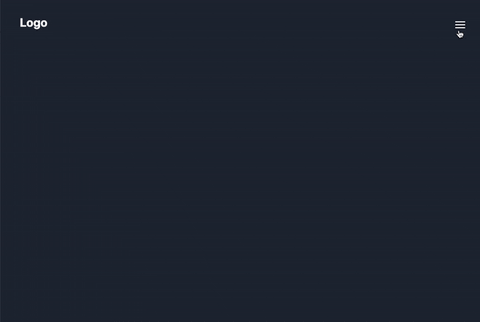
In this article, we're going to build a full-screen mobile menu with an animated hamburger icon, using React and Tailwind. I've included a preview below so you can see the finished result, and the icon up-close. Alternatively, you can check out the GitHub repo to see the completed code for yourself.

Before we get stuck in, it's worth pointing out that the icon animation works best when you're using React Router or NextJS (because the page won't reload, which creates a smoother animation), so if you've not used either of them before then I'd recommend checking them out.
Table of Contents
Structure
Handling State
Adding Content to the Components
Adding the Hamburger Icon
Structure
Initialise your Project
Okay, let's get started!
The quickest way to get up and running is to use Create React App, and as we're going to be using Tailwind for styling we may as well get both set up together.
If you don't already have a project open, then follow the steps on this page of the Tailwind docs to initialise your React project and install Tailwind.
If you'd prefer to set up a Next Js project, simply follow these steps before continuing to the next section.
Create your Components
Once you've initialised your project, we're going to start creating some empty components that we'll fill as we go.
For this tutorial, we're going to create just two components: a header, which will contain a logo and our animated icon; and a full screen overlay which will contain an overlay background and some menu items.
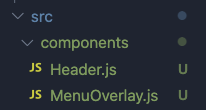
First of all, create a components folder inside of the src folder. In the new /src/components folder, create a file called Header.js, and another called MenuOverlay.js.
Inside of each file, create a simple functional component, or use the code below to speed things along (remembering to change 'Header' to 'MenuOverlay' for the second component).
import React from "react";

const Header = () => {
  return <></>;
};
export default Header;
Import your Components into App.js
Once you've made both components, go back into App.js and import them like so:
import Header from "./components/Header";
import MenuOverlay from "./components/MenuOverlay";
Next, we're going to place the components inside the return statement of App.js (wrapped in a div or React fragment, because otherwise React will get angry at you and you'll get an error). They might be empty components right now, but we've got our structure in place so we won't need to hook up any more components as we go, or at the end.
function App() {
  return (
    <div>
      <Header />
      <MenuOverlay />
    </div>
  );
}
Handling State
Setting up useState
In App.js, we're going to the useState hook to track whether the mobile menu is open or closed, switching the state whenever we click our button in Header.js.
First, we're going to import the useState hook at the top of App.js:
import React, { useState } from "react";
Then we'll set our state and our setState function.
const [navbarOpen, setNavbarOpen] = useState(false);
Finally, we're also going to set some basic styles on our wrapper div, setting a minimum height and a background colour (see below). Your App.js file should now look like this:
import React, { useState } from "react";
import Header from "./components/Header";
import MenuOverlay from "./components/MenuOverlay";

function App() {
  const [navbarOpen, setNavbarOpen] = useState(false);

  return (
  <div className="App w-full min-h-screen bg-gray-800">
      <Header />
      <MenuOverlay />
    </div>
  );
}

export default App;
Passing State into Components
At the moment, we've declared our useState, but we're not using it. So, we're going to pass both the state variable (navbarOpen) and the function (setNavbarOpen) into both of our components as props, like so:
<Header navbarOpen={navbarOpen} setNavbarOpen={setNavbarOpen} />
<MenuOverlay navbarOpen={navbarOpen} setNavbarOpen={setNavbarOpen} />
This way, when the navBarOpen boolean changes (eg from true to false) the nav bar will close along with it. Oh, and the icon will change inside of the header component, too... but we'll get to that.
Accessing State Inside Components
Inside of both of our components, we're going de-structure our props so that we can use them inside of each component. Simple change your component declarations to the following, to pull the props through:
// Header.js
const Header = ({ navbarOpen, setNavbarOpen }) => {
// MenuOverlay.js
const MenuOverlay = ({ navbarOpen, setNavbarOpen }) => {
Now that we set up our components, imported them into the main app, and created a useState hook to handle state, we're ready to start building and styling the components!
Adding Content to the Components
Building the Header
In Header.js, we're going to build a basic header component that will hold our hamburger icon a little later on.
Using Tailwind, we're going to create a full-width header element, fix it to the top of the window, then add a div for our logo, and a button for our hamburger icon:
const Header = ({ navbarOpen, setNavbarOpen }) => {
  return (
   <header className="w-full fixed top-0 left-0 p-10 flex z-20">
      <div className="text-white flex-grow z-20">
        <h1 className="text-2xl font-bold my-0">Logo</h1>
      </div>
      <button
        className="lg:hidden flex top-0 right-0 z-20 relative w-10 h-10 text-white focus:outline-none"
        onClick={() => setNavbarOpen(!navbarOpen)}
      >
        Icon will go here
      </button>
    </header>
  );
};
export default Header;
You'll notice we've used flex on the header element to align its children next to each other, and z-20 so that the logo will still be visible when the overlay menu appears.
Importantly, we've also added an onClick function to our button, to switch the status of navBarOpen (from open to closed, or vice versa) when clicked.
onClick={() => setNavbarOpen(!navbarOpen)}
While the button element only holds text at the moment, we'll be adding our animated icon a little later on as part of its own section of the tutorial, and explaining how it works.
Building the Menu Overlay
In MenuOverlay.js, add a nav element, and an unordered list inside of the return statement:
return (
<nav>
    <ul>
      <li>
        <a href="/">Home</a>
      </li>
      <li>
        <a href="/">About</a>
      </li>
    </ul>
  </nav>
);
It might be basic at the moment, but now we're going to start adding styles and it'll really come to life... I promise!
Styling the Menu Items
Inside the nav element, you should replace the unordered list with the following:
// MenuOverlay.js Styles
<ul className="w-full flex flex-col items-start">
    <li className="nav-li">
        <a
        href="/"
        className="nav-link"
        onClick={() => {
            setNavbarOpen(false);
        }}
        >
        Home
        </a>
    </li>
    <li className="nav-li">
        <a
        href="/"
        className="nav-link"
        onClick={() => {
            setNavbarOpen(false);
        }}
        >
        About
        </a>
    </li>
</ul>
You've probably noticed that each li carries the class nav-li, and each anchor tag has the class nav-link. To add these classes, simply add the following to your globals/index.css:
// global or index.css
@layer components {
  .nav-li {
    @apply flex w-full leading-8 list-none focus:outline-none group py-2 tracking-normal opacity-50 hover:opacity-100 transition-all duration-200 ease-in-out;
  }
}

@layer components {
  .nav-link {
    @apply h-full w-full py-2 text-lg text-white;
  }
}
Alternatively, you can add the list of classes to the li and anchor elements respectively, but this creates a lot of repetition, so I'd recommend sticking to the steps above!
Styling the Full-Screen Menu
Next, we need to add some simple styles for our full-screen menu. Replace your nav element opening with the following code:
 <nav
      className={`fixed flex top-0 left-0 w-full px-10 z-10 h-screen pt-24 bg-gray-900 transform delay-100 transition-all duration-300 ${
        navbarOpen ? "opacity-100 translate-x-0" : "opacity-0 -translate-x-full"
      }`}
    >
This fixes the nav element to the browser, adds some padding and a background colour, and some transition settings. There's also a simple ternary statement in the template literal, animating the opacity and the position of the nav element when the button is clicked so that it swipes in from the side and fades in at the same time.
Well done, your MenuOverlay.js is complete! It should now look like this...
import React from "react";

const MenuOverlay = ({ navbarOpen, setNavbarOpen }) => {
  return (
    <nav
      className={`fixed flex top-0 left-0 w-full p-10 z-10 h-screen pt-24 bg-gray-900 text-white bg-opacity-100 transform delay-100 transition-all duration-300 ${
        navbarOpen ? "opacity-100 translate-x-0" : "opacity-0 -translate-x-full"
      }`}
    >
      <ul className="flex flex-col items-start">
        <li className="nav-li">
          <a
            href="/"
            className="nav-link"
            onClick={() => {
              setNavbarOpen(false);
            }}
          >
            Home
          </a>
        </li>
        <li className="nav-li">
          <a
            href="/"
            className="nav-link"
            onClick={() => {
              setNavbarOpen(false);
            }}
          >
            About
          </a>
        </li>
      </ul>
    </nav>
  );
};

export default MenuOverlay;
Almost there...!
Things should be starting to come together, and while you don't have a hamburger icon just yet, you should be able to click the button in Header.js to hide and show the full-screen overlay.
Now then... the stage is set and we're ready to build our hamburger icon. Let's get to it!
Adding the Hamburger Icon
Now that you're familiar with conditional classes, we're going to add the hamburger icon into the mix (because it has a lot of them!).
Take a close look at the GIF below, and you'll see our icon is made up of three horizontal lines, with the top two rotating when the button is clicked (to form an 'X'), and the middle one collapsing down to the left-hand side of itself.
The Code
Replace the button in Header.js with the code below, and then we'll take a closer look at what's happening here.
// Header.js
<button
className="lg:hidden flex top-0 right-0 z-20 relative w-10 h-10 text-white focus:outline-none"
onClick={() => setNavbarOpen(!navbarOpen)}
>
<div className="absolute w-5 transform -translate-x-1/2 -translate-y-1/2 left-1/2 top-1/2">
    <span
    className={`absolute h-0.5 w-5 bg-white transform transition duration-300 ease-in-out ${
        navbarOpen ? "rotate-45 delay-200" : "-translate-y-1.5"
    }`}
    ></span>
    <span
    className={`absolute h-0.5 bg-white transform transition-all duration-200 ease-in-out ${
        navbarOpen ? "w-0 opacity-50" : "w-5 delay-200 opacity-100"
    }`}
    ></span>
    <span
    className={`absolute h-0.5 w-5 bg-white transform transition duration-300 ease-in-out ${
        navbarOpen ? "-rotate-45 delay-200" : "translate-y-1.5"
    }`}
    ></span>
</div>
</button>
How Does the Icon Work?
Our animating hamburger icon is made up of a button element, with an inner container div. Inside the div are three spans, with each span representing a line in the icon.
The Button
Our button is hidden on a large device (above 1024px), has a fixed width and height of 10 (on Tailwind's scale), we've turned off the default outline on focus, and set the z-index to z-20 so that it sits on top of the overlay. Of course, we've also got our onClick function handling the opening and closing of our menu.
<button
className="lg:hidden flex z-20 relative w-10 h-10 text-white focus:outline-none"
onClick={() => setNavbarOpen(!navbarOpen)}
>
The Inner Container Div
The inner container is absolutely positioned in the center of the button... nice and simple!
<div className="absolute w-5 transform -translate-x-1/2 -translate-y-1/2 left-1/2 top-1/2">
The Top and Bottom Line
The top and bottom lines in our icon simply rotate 45 degrees to form an 'X' when clicked, and return to normal when our menu is closed. Note that the top line includes "rotate-45" and the bottom line "-rotate-45".
<span
className={`absolute h-0.5 w-5 bg-white transform transition duration-300 ease-in-out ${
    navbarOpen ? "rotate-45 delay-200" : "-translate-y-1.5"
}`}
></span>
The Middle Line
The middle line follows the same pattern as the others, but transitions between a width of 0 and 5, with to handle its timing.
<span
className={`absolute h-0.5 bg-white transform transition-all duration-200 ease-in-out ${
    navbarOpen ? "w-0 opacity-50" : "w-5 delay-200 opacity-100"
}`}
></span>
Adding the Width Transition
Finally, to avoid errors, we need to add 'width' as a transition property in our tailwind.config.js so that the middle line animates as it should:
theme: {
    extend: {
      transitionProperty: {
        width: "width",
      },
    },
  }
Voilà!
And there we go, you've got yourself a fancy new animated full-screen menu and hamburger icon! Wasn't that easy?
Check out the GitHub repo for this project if you'd like to see the finished code, and feel free to connect with me on Twitter for more coding related content!